

a 10 million target audience
As a public service company, SVT’s target audience is the entire country and its 10 million people. A challenging and exciting starting point. How can we appeal to all, yet not be bland?
SVT Rebrand Launch Film. Role: Director
branding a nation.
The SVT vision is to make the nation more inquisitive and informed and to create content that engages, entertains and enriches—in the service of the public.
For Everyone, anywhere.
The concept is to show homes and places across Sweden to stay true to the brand promise “for everyone, everywhere”. Pre-teen or pensioner, television or smartphone.
The purpose of an ident is to build brand awareness, take ownership of content and set the mood for entertainment. And be interesting enough to allow for repeat viewing.
From the classic red cottage, to suburb and mobile locations like tents—an aesthetically pleasing break, showcasing different Swedish living situations. Consciously avoiding to show faces of every gender and race, this concept has a longer long shelf-life—shows breadth and inclusivity through dozens of locations shot across Sweden, with infinite possibilities to show more places, situations and homes. Tied together by the subtle sound of different programming, to leave room for the viewer, to fill in the blanks and imagine who and waht, could be inside the location.
image, sound and motion in its Dna.
As the Motion Design Director—responsible for the concept and movement of the brand across any screen, any platform.

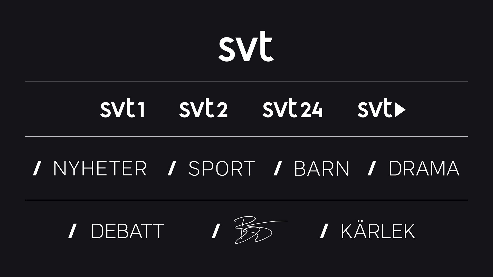
Brand architecture

Logotype to symbol loop

a symbol hidden within.
From a classic, well-crafted typographic logotype—it animates into a symbol hidden within the angle of the letter V, to create a visual structure for sub-brands.
But it can also be used playfully, as a communication device and simultaneously buil brand recognition in a subtle and functional way. The symbol concept hasn’t been overused at this time as it’s built for years to come and is applied in / SPORT / DRAMA and / KIDS.
Brand architecture

The slash symbol used as a communication device

Branded block for / SPORT

Customisable framework and intro for / DRAMA